h7lyx.com/
...
UI/UX
UI/UX is the second roadmap project.
UI, User Interface is the visual part of the website people interact with, like the buttons and layout.
UX, User Experience is the overall feeling they get when using it.
Since it is important for my collage assignments to be well documented,
I wanted to develop a visually polished website for it's documentation.
This documentation features timelapses of the website's development,
issues I faced, reasoning behind design choices and more.
Aside from "working together" this project aims to tick off as many focus points as possible.
This includes, researching, giving meaning, project management, personal growth and design.
Design, project management & personal growth are the primary focus points in this projects.
Table of contents
– Orientation & Research –
– Learning Process & Growth –
- Style & Design Rationale -
- Design & Execution -
– Iterative Management –
Orientation & Research
I felt that the previous iteration of h7lyx.com did not reflect my designing skills well.
Which identified my primary problem: the lack of a representative portfolio.
After conducting some research into various website builders, I discovered Framer.
Framer is a builder that offers the ability to build professional,
interactive websites with minimal to no coding depending on your preferences.
It is heavily design-oriented, which was exactly what I needed.
To take full advantage of Framer's capabilities, I marked UI/UX as a roadmap project.
The objective was to embed design rules and strive for the user experience.
This would ensure the documentation of any project met high standards.
This of course required research into the core principles of effective web design.
I analysed layout, typography, and visual hierarchy to understand how to guide attention.
I utilised expert content on YouTube as my primary source for this theoretical research.
With [this link] you can view the curated playlist I compiled.
Learning Curve
I had some familiarity with Framer’s interface due to my experience with Figma.
Figma is a design tool used to create visual blueprints of websites before building starts.
Although I did not build h7lyx.com in Figma, the similarities helped me grasp the basics.
Despite this head start, Framer’s creative freedom introduced significant complexity.
I aimed to create a combination of advanced yet simplistic mechanics.
These included custom animations that react to scrolling and interactive buttons.
However, these features proved technically challenging as a beginner in Framer.
To maintain quality within the timeline, I had to simplify the project scope.
Features like an "Elaborated Description" pop-up window,
but also an Interactive "Roadmap" timeline were scrapped.
This decision process was crucial to my growth.
It required interpreting technical limitations and adapting the design accordingly.
Traces of these scrapped changes can be seen in the Iterative Management section.
The two-month development cycle ended with the BETA 1.0 release on 29/08/25.
This period was heavily weighted towards troubleshooting.
Roughly half my time was spent solving logic puzzles.
Style & Design Rationale
Visual Identity & Atmosphere
I introduced animated blurred gradients as dynamic backgrounds.
This design choice moves away from a static interface.
It creates a sense of simplicity, and a modern feel.
The subtle movement keeps the interface feeling alive,
without distracting from the main content.
This aligns with my goal of a polished, high-quality user experience.
Site Architecture:
I completely redesigned the homepage into a centralised Portal.
Previously, users would "spawn" directly inside Centre, which was disorienting.
The Portal solves this by acting as a clear starting hub.
From here, users have the agency to choose their environment (Exe or h7lyx).
To assist newcomers, I implemented a "New to h7lyx?" pop-up.
This serves as an onboarding tool.
It briefly explains how the site works and addresses responsive design behaviour.
This ensures clarity from the very first interaction.
Navigation & Consistency
To improve wayfinding, I enhanced the buttons in the 'Centre' and 'EXE' sections.
They now feature explicit descriptions of what lies ahead.
This reduces cognitive load , as users no longer have to guess the button's function.
I also enforced a strict rule for visual consistency regarding corner radii.
All primary containers (Big Boxes) use a radius of 20px.
Internal elements strictly use a radius of 12px.
This nested hierarchy creates a subconscious sense of order and polish across the site.
Typography: JetBrains Mono
I selected JetBrains Mono as the primary typeface.
This is a monospaced font typically used by programmers in code editors.
By using it I reinforce the technical, engineering-focused theme of the site.
It suggests precision and structure, which aligns with documenting a technical process.
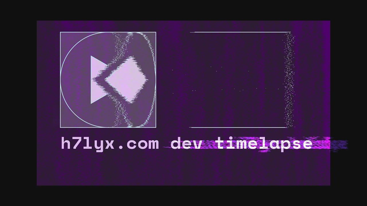
Timelapse
Since describing developing this project with words is quite difficult,
I've made a compilation of several timelapses.
This approach provides a clearer idea in design process,
showing my decisions and workflow in a way that text cannot easily capture.
The timelapse can be found using the video player bellow.
In the video's description a detailed explanation can be found,
which covers information from each chapter using timestamps.
Version History
Rather than making several more paragraphs I've chosen to make something interactive.
This tool clearly demonstrates my iterative development process.
It portrays how the project grew and improved over time much better than words can.
In order to show how much the site has grown from when it opened to public BETA,
I have developed a custom Version History html environment.
Using the download button bellow you may download it for yourself, fully offline!
After downloading the Zipped file extract the file and open "Version Viewer.html".
On the left you can navigate site versions, and on the right you can see what's new!
Stuck in a version? Use Alt+ ← for Windows or Option+ ← for Mac.
The Version History environment will continue to receive updates in [dev],
this is because project documentation must stay static for reviews by experts.